
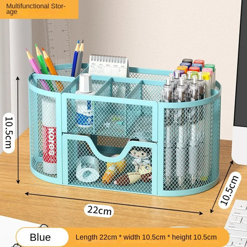
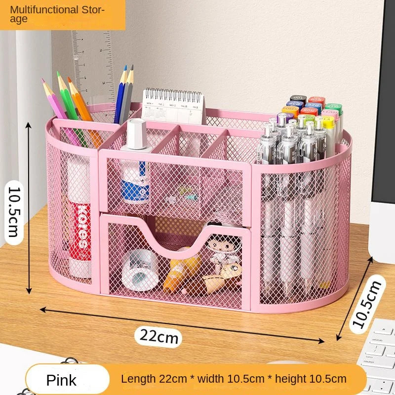
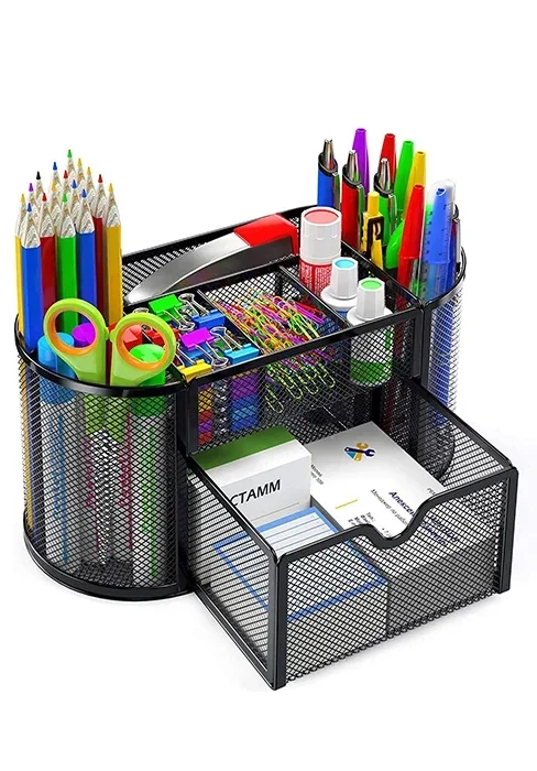
Desk Organizer Mesh Desktop Office Supplies Multi-functional Caddy Pen Holder Stationery with 8 Compartments and 1 Drawer
SPECIFICATIONS
High-concerned chemical: None
Material: Metal
Novelty: FANTASTIC
Shape: Other
Style: Other
Type: Pen Holders
Use: Calendar,Clock,Temperature Display
Product Description

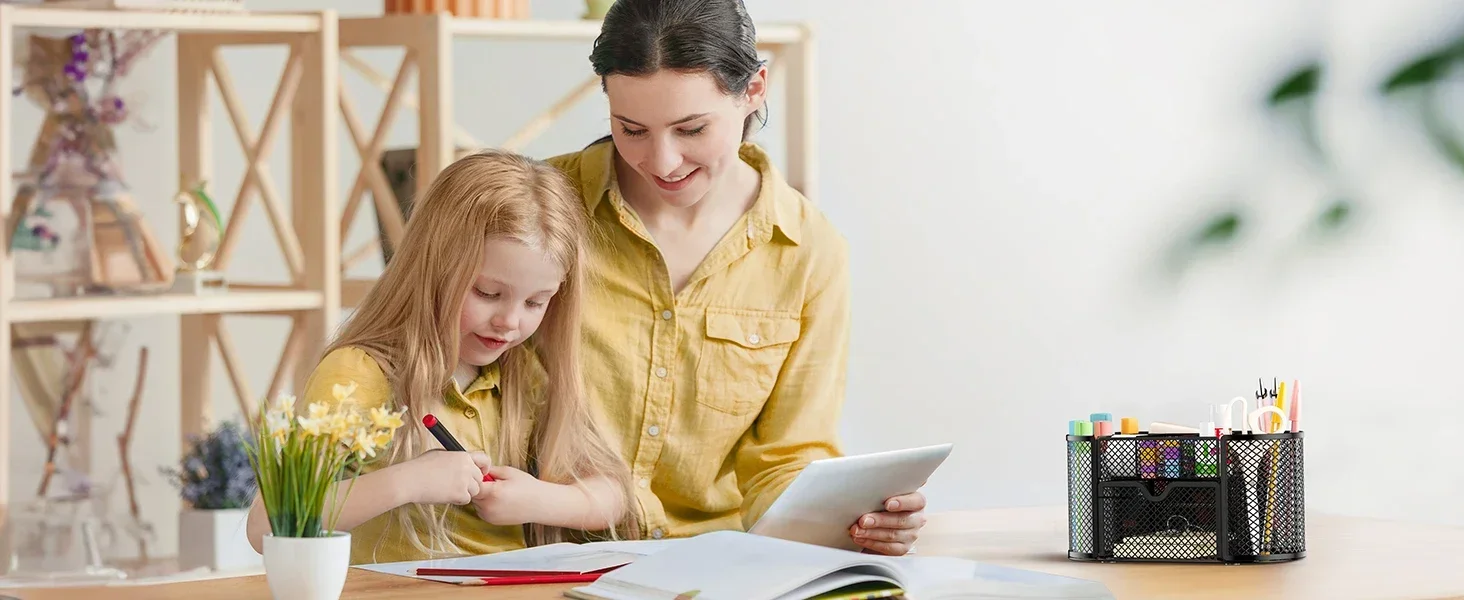
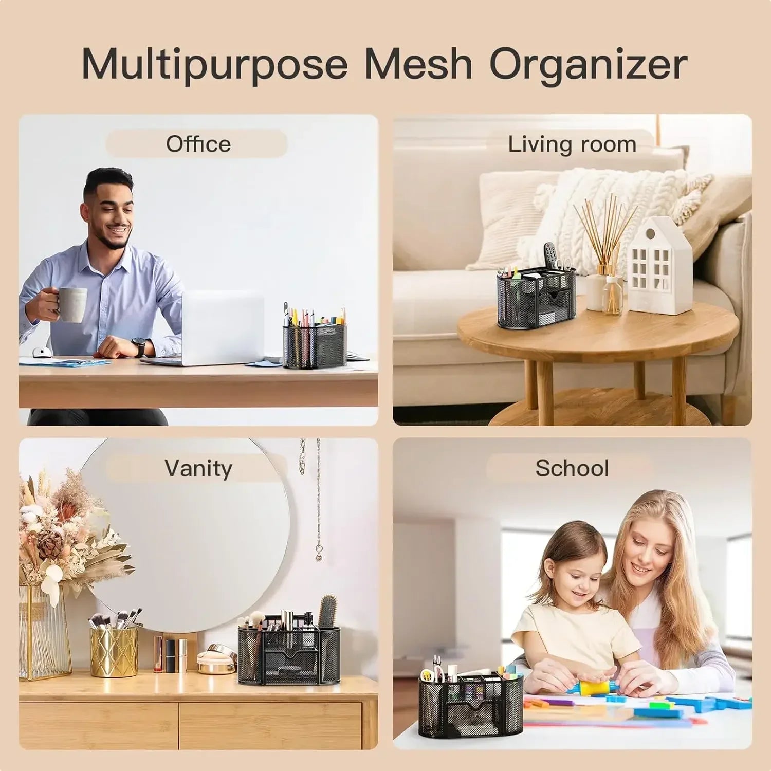
1 OFFICE 2 SCHOOL 3 HOME
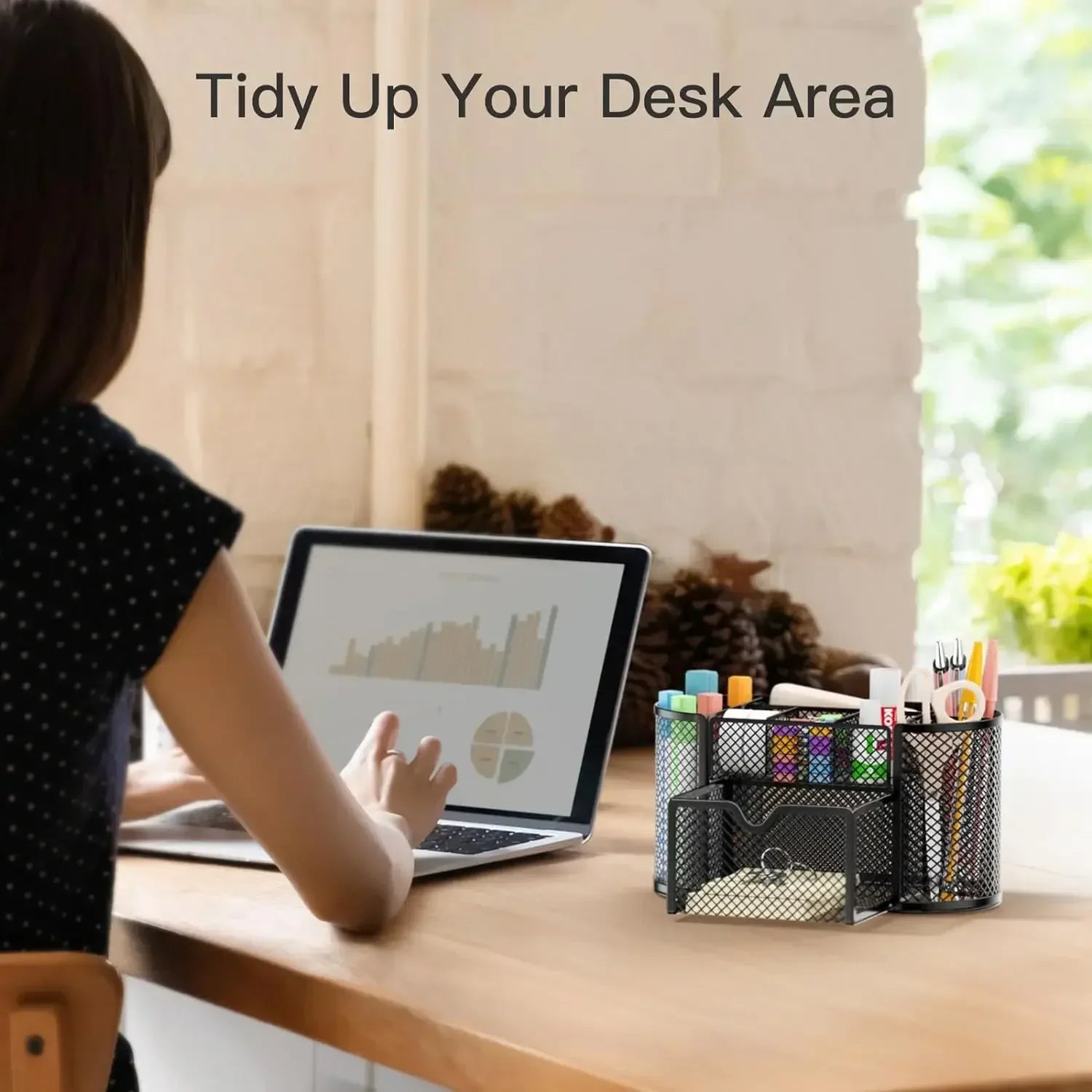
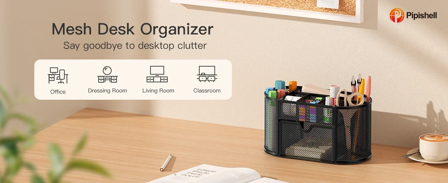
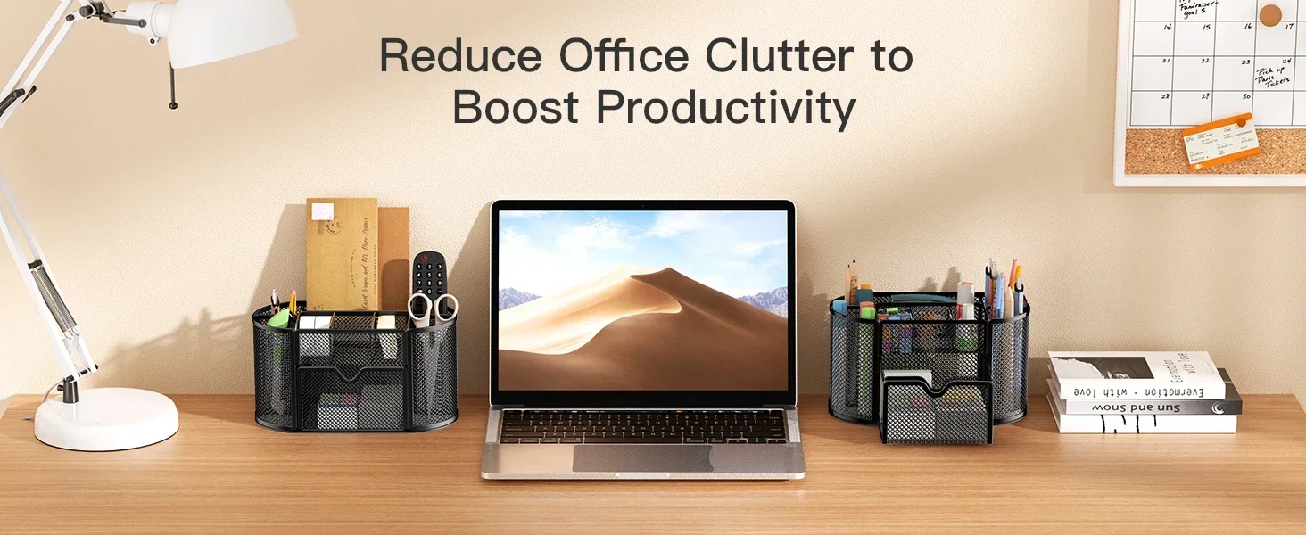
Make the Most of Your Space
Pipishell Office Mesh Desk Organizer
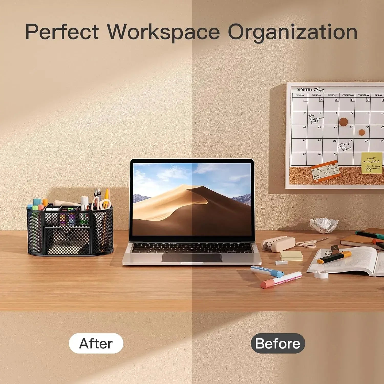
Are you looking for the perfect way to declutter your desk?
Pipishell mesh multi-functional stationery organizer's efficient layout keeps your workspace looking tidy and gives you easy access to whatever you need.
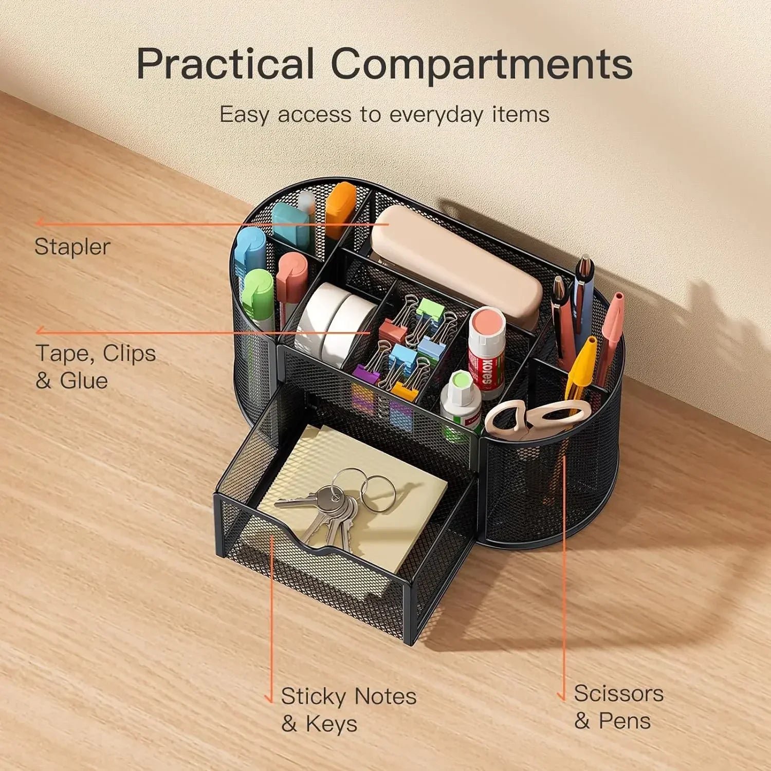
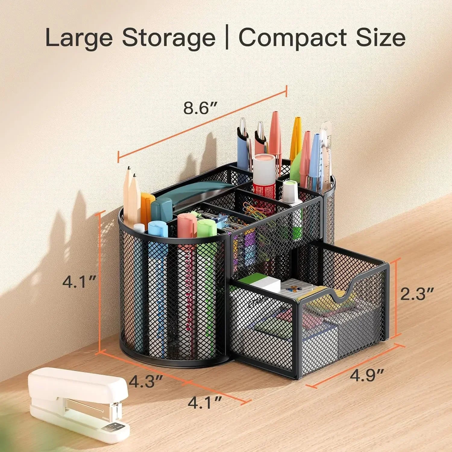
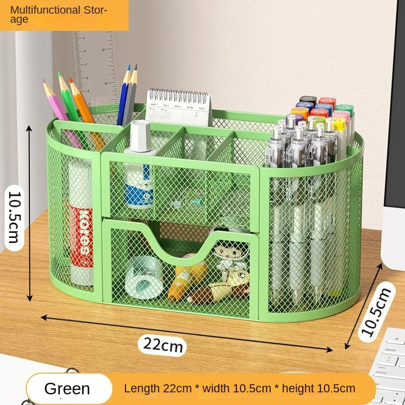
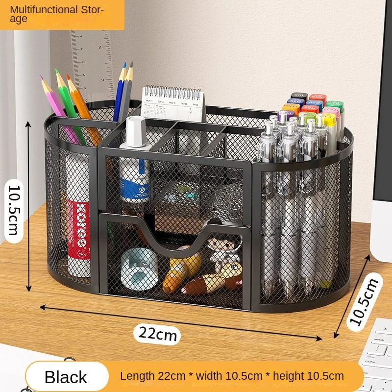
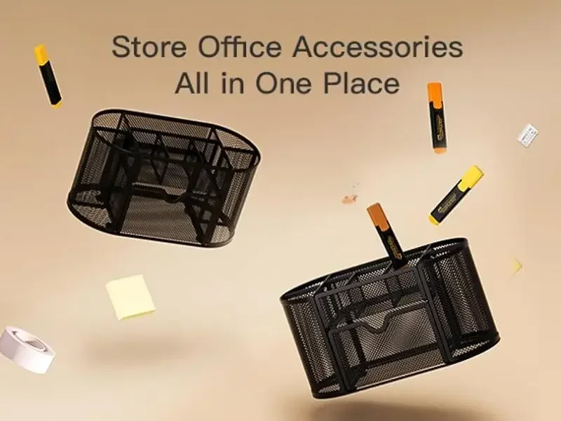
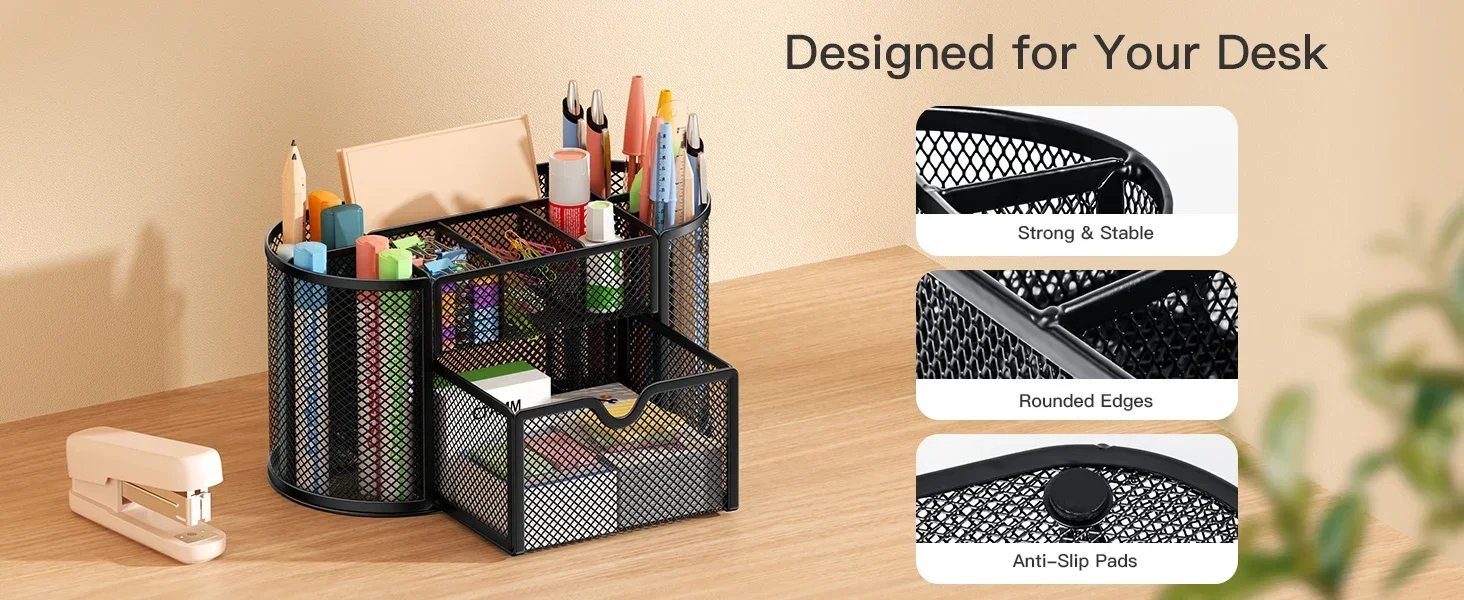
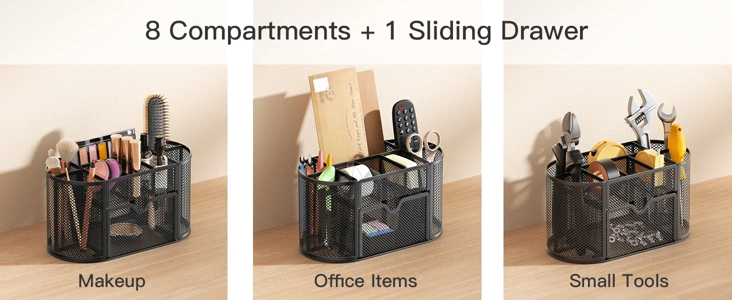
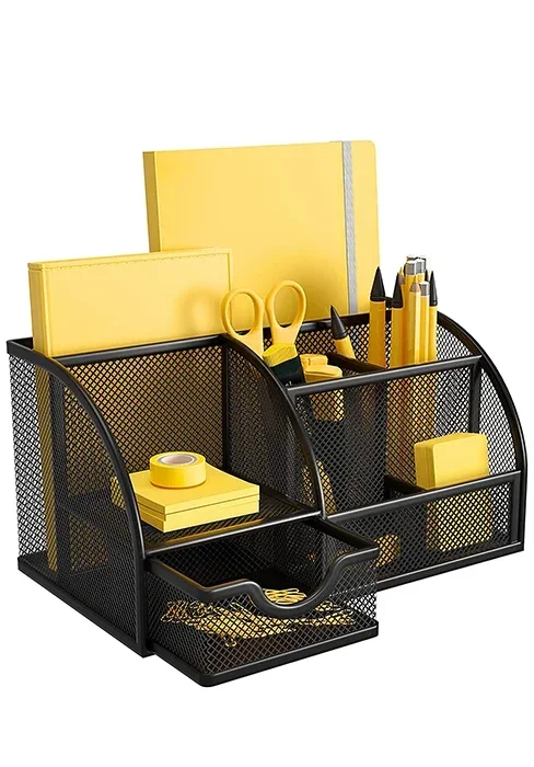
This mesh desktop organizer has 9 compartments (8 parts + 1 slide drawer ) for your pens, pencils, sharpeners, staplers, scissors, rulers, razors, glue sticks and suitable for home, office, work, school, classroom, studio, etc
Easy to See What You Need
Keeping Your Desktop Neat and Tidy
Mesh Desk Organizer PIDO2
Pipishell Desk Organizer
Multi-Functional |
||
Space-Saving |
||
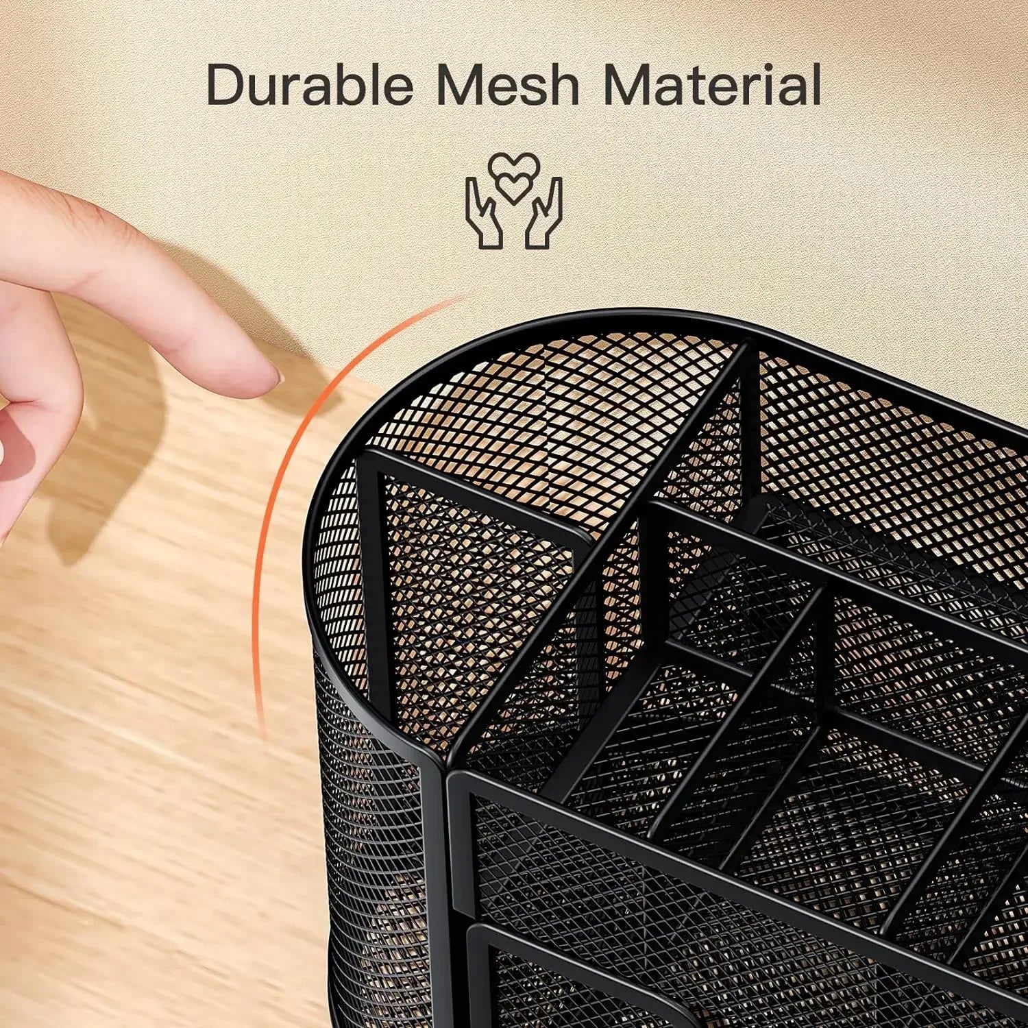
Non-Slip & Durable |
||
6 parts and 1 drawer |
Compartments |
8 parts and 1 drawer |
5.5"D x 5"W x 8.7"H |
Size |
4.3"D x 4"W x 8.6"H |
office, home, school |
Perfect For |
office, home, school |
Multi-Functional |
||
Space-Saving |
||
Non-Slip & Durable |
||
6 parts and 1 drawer |
Compartments |
6 parts and 1 drawer |
5.5"D x 5"W x 8.7"H |
Size |
5.5"D x 5"W x 8.7"H |
office, home, school |
Perfect For |
office, home, school |
- Mesh Desk Organizer PIDO1
- Mesh Desk Organizer PIDO2
.aplus-v2 .apm-brand-story-carousel-container {
position: relative;
}
.aplus-v2 .apm-brand-story-carousel-hero-container,
.aplus-v2 .apm-brand-story-carousel-hero-container > div {
position: absolute;
width: 100%;
}/*
Ensuring the carousel takes only the space it needs.
The sizes need to be set again on the absolutely positioned elements so they can take up space.
*/
.aplus-v2 .apm-brand-story-carousel-container,
.aplus-v2 .apm-brand-story-carousel-hero-container {
height: 625px;
width: 100%;
max-width: 1464px;
margin-left: auto;
margin-right: auto;
overflow: hidden;
}
/*
This centers the carousel vertically on top of the hero image container and after the logo area (125px).
Margin-top = (heroHeight - cardHeight - logoAreaHeight) / 2 + logoAreaHeight
*/
.aplus-v2 .apm-brand-story-carousel .a-carousel-row-inner{
margin-top: 149px;
}
/*
Cards need to have a width set, otherwise they default to 50px or so.
All cards must have the same width. The carousel will resize itself so all cards take the width of the largest card.
The left margin is for leaving a space between each card.
*/
.aplus-v2 .apm-brand-story-carousel .a-carousel-card {
width: 362px;
margin-left: 30px !important;
}
/* styling the navigation buttons so they are taller, flush with the sides, and have a clean white background */
.aplus-v2 .apm-brand-story-carousel .a-carousel-col.a-carousel-left,
.aplus-v2 .apm-brand-story-carousel .a-carousel-col.a-carousel-right {
padding: 0px;
}
.aplus-v2 .apm-brand-story-carousel .a-carousel-col.a-carousel-left .a-button-image,
.aplus-v2 .apm-brand-story-carousel .a-carousel-col.a-carousel-right .a-button-image {
border: none;
margin: 0px;
}
.aplus-v2 .apm-brand-story-carousel .a-carousel-col.a-carousel-left .a-button-image .a-button-inner,
.aplus-v2 .apm-brand-story-carousel .a-carousel-col.a-carousel-right .a-button-image .a-button-inner {
background: #fff;
padding: 20px 6px;
}
.aplus-v2 .apm-brand-story-carousel .a-carousel-col.a-carousel-left .a-button-image .a-button-inner {
border-radius: 0px 4px 4px 0px;
}
.aplus-v2 .apm-brand-story-carousel .a-carousel-col.a-carousel-right .a-button-image .a-button-inner {
border-radius: 4px 0px 0px 4px;
}